It’s a feeling every site owner knows: you check your analytics, and there it is.It’s a feeling every site owner knows: you check your analytics, and there it is. A high bounce rate. That sinking feeling comes from seeing visitor after visitor land on your site, only to leave without clicking a single thing. It’s frustrating.
To fix this, we have to deliver an experience that’s fast, crystal clear, and immediately relevant from the moment someone arrives. This usually means a deep dive into optimizing page speed, making your content incredibly easy to read, and ensuring your site is a breeze to use, especially on a phone.
Why Half Your Visitors Leave and How to Stop Them
A high bounce rate is so much more than a number on a dashboard. It’s a direct signal of a missed connection, a lost opportunity.
Think about it this way: for a local plumber, every visitor who bounces is a leaky faucet that never gets fixed because the potential customer never called. For an online shop, it's a shopping cart that was never filled. When you see it as a critical health indicator for your business, it stops being a passive stat and becomes a problem you can actively solve.
The real issue almost always comes down to a simple mismatch. The visitor expected one thing, and your page either delivered something else entirely or it just took too long to deliver anything at all. In the online world, that kind of friction is a deal-breaker.
The Mobile Experience Disconnect
Knowing where your bounces are happening is just as important as knowing why. While the average bounce rate across all industries hovers around 45%, that number doesn't tell the whole story. Not even close.
On mobile devices, bounce rates can skyrocket to 60% or more, while desktops often sit in the 48-50% range. What's the main culprit? Speed. Data from Google has shown for years that 53% of mobile visitors will ditch a site if it takes longer than three seconds to load. Every millisecond really does count. For more details on these benchmarks, check out this great bounce rate overview on Calconic.com.
This huge gap reveals a common blind spot for business owners. We spend most of our time looking at our own websites on big, fast desktop monitors in the office. A page that looks fantastic to us might be a slow, clunky, frustrating mess on a smartphone, bleeding visitors and potential revenue.
Key Takeaway: A high bounce rate isn't just about "bad content." It's often a technical or user experience failure. It’s a sign that your website isn’t meeting the most basic expectations of your audience, especially those on mobile.
Creating an Immediate Sense of Place
To stop visitors from hitting the back button, your website has to instantly answer three questions that pop into their heads, whether they realize it or not:
- Where am I? Your headline and main image should scream, "Yes, you're in the right place!"
- What can I do here? Is the navigation obvious? Is the main call-to-action easy to spot?
- Why should I care? The content they see without scrolling (the "above the fold" area) must quickly communicate the value you bring to the table.
If you can't answer these questions in the first three to five seconds, you're practically asking people to leave. The strategies we're about to cover are designed to help you nail these answers and start turning those fleeting visits into real engagement.
Before we dive deep, here's a quick checklist of things you can look at right now to start making an impact.
Bounce Rate Quick Fix Checklist
This table summarizes some of the most common issues and the immediate actions you can take. Think of it as your triage list for lowering your bounce rate today.
| Area of Focus | Quick Action | Why It Works |
|---|---|---|
| Page Speed | Run your homepage through Google's PageSpeed Insights and tackle the top recommendation, like "compress images." | Slow loading is the #1 reason for mobile bounces. A faster site immediately feels more professional and usable. |
| Above-the-Fold Clarity | Ask a friend to look at your homepage for 5 seconds and describe what you do. If they can't, rewrite your main headline. | Visitors make snap judgments. A clear, benefit-driven headline confirms they're in the right place. |
| Mobile Navigation | Open your site on your phone. Can you easily tap the menu and read the options? If not, increase font sizes and button spacing. | A frustrating mobile menu is an instant turn-off, preventing users from exploring your site further. |
| Internal Linking | Add at least one relevant link to another page or blog post within the first two paragraphs of your most-visited pages. | Encourages visitors to continue their journey on your site, which by definition, prevents a bounce. |
Tackling even one or two items from this list can make a noticeable difference. Now, let's get into the detailed playbook for a more comprehensive fix.
Find Your Leakiest Pages with Google Analytics
Before you can fix anything, you have to know what's broken. Diving into website changes without data is just guesswork. You might get lucky, but you'll probably just waste a ton of time. Think of Google Analytics 4 (GA4) as your diagnostic tool—it’s how you stop guessing and start knowing exactly where your site is bleeding visitors.
The goal here isn't to become a data scientist overnight. It's simply to find the specific pages that are actively pushing people away. These "problem pages" are the ones with low engagement, and they're costing you business.
Ideally, the user journey is simple: a visitor lands, the page loads in a snap, and they find what they need, so they stick around.
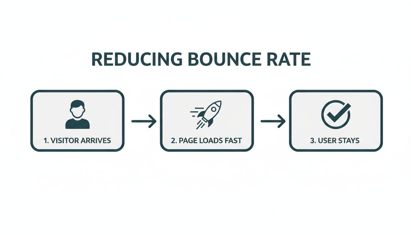
This simple flow shows just how critical those first few seconds are. It's the moment that decides whether a user bounces or actually engages with your site.
Digging for Clues in GA4 Explorations
GA4 can look intimidating at first, I get it. But the "Explorations" feature is your secret weapon. It lets you build a custom report from scratch, so you can slice and dice your data to find real insights instead of just staring at canned dashboards.
Let’s build a quick report to find your weakest links.
- First, head to the Explore section in the left-hand menu of your GA4 account.
- Click the Blank template to start with a clean slate.
- Next, you need to import your building blocks. In the "Variables" column, click the "+" next to "Dimensions" and pull in
Page path and screen classandDevice category. - Now, do the same for "Metrics"—click the "+" and add
Bounce rateandViews.
With your ingredients ready, just drag Page path and Device category into the "Rows" box. Then drag Bounce rate and Views into the "Values" box. Boom. You now have a table showing the bounce rate for every single page, neatly broken down by desktop, mobile, and tablet.
My Pro Tip: Don't get distracted by a page with an 80% bounce rate and only 10 views. Sort your new report by "Views" from highest to lowest. The real problem is the page with a 75% bounce rate that gets 5,000 views a month. That's where you're losing the most potential business.
From Data to Actionable Questions
Once you have this report, you're not just looking at numbers anymore. You're looking at specific problems you can solve. This is how you shift from wondering what’s wrong to knowing precisely where to focus your energy.
Let's say you're a local contractor. Your report shows that the /emergency-services page has an 85% bounce rate on mobile, but it’s a respectable 40% on desktop. This isn't a content problem; it's a mobile experience issue. The data just told you exactly where to look.
As you look at your top problem pages, start asking pointed questions:
- Is there a device disconnect? If mobile bounce is way higher, pull up that page on your phone right now. Is the text tiny? Are the buttons impossible to tap? Is a pop-up covering the whole screen?
- Is there a traffic mismatch? You can add
Session source / mediumas another dimension. Maybe you’ll find that traffic from a specific Facebook ad campaign is bouncing instantly. This usually means your ad promises one thing, but the landing page delivers something else entirely. - Is the page just plain slow? If a page has a high bounce rate across all devices and traffic sources, it often points to a universal problem like slow page speed. Nobody waits for a slow website.
This focused approach turns analytics from a confusing chore into your most valuable diagnostic tool. Instead of randomly tweaking your homepage and hoping for the best, you can now zero in on the exact pages that are costing you leads and sales.
Win the First Three Seconds with Page Speed Optimization
You have about three seconds. That's it. That’s the window you have to capture a visitor's attention before their patience runs out and they hit the back button. A slow website is the silent killer of conversions, often the biggest technical reason a potential customer leaves before they even see what you have to offer.
Think about it in real-world terms. If you walked up to a store and the door took ten seconds to creak open, would you stick around? Probably not. You'd be annoyed and likely assume something was wrong. A slow-loading website creates that exact same friction online, souring the experience from the very first click.

This isn't just about making people happy; it’s about making money. Websites that load in a snappy 2 seconds enjoy an average bounce rate of just 9%. But let that load time creep up to 5 seconds, and the bounce rate shoots up to a painful 38%.
Given that the average mobile site takes a sluggish 8.6 seconds to load—well past Google’s recommended 3-second threshold—it's easy to see why so many businesses struggle. Boosting your site speed isn’t just a minor tweak; it’s a major lever for growth. We’ve seen case studies where simply making a site faster led to a 736% increase in qualified leads. You can find more stats like these on LuckyOrange's breakdown of key website metrics.
Your WordPress Speed-Up Checklist
If you’re running on WordPress, you're in luck. There's a whole ecosystem of tools out there ready to help you speed things up without needing a developer on standby. Here’s where to focus for the biggest impact.
High-Impact Page Speed Fixes for WordPress
Tackling page speed on WordPress doesn't have to be a massive technical project. Often, a few strategic changes can yield huge results. The table below highlights some of the most common culprits behind slow sites and the most effective ways to fix them.
| Problem | Recommended Solution | Estimated Impact on Speed |
|---|---|---|
| Large, Unoptimized Images | Use a plugin like ShortPixel or Smush to automatically compress images on upload. | High (often the #1 issue) |
| No Caching System | Install a caching plugin like WP Rocket (premium) or W3 Total Cache (free). | High |
| Slow or Cheap Hosting | Migrate to a managed WordPress host like WP Engine or Kinsta. | Very High |
| Bloated Page Builders | Rebuild key pages with a lightweight builder like GeneratePress or Kadence. | Medium to High |
| Too Many External Scripts | Audit your scripts (analytics, ads, etc.) and remove or delay non-essentials. | Medium |
By focusing on these areas first, you're addressing the low-hanging fruit that can dramatically improve how quickly your pages load for visitors, directly impacting your bounce rate.
Compress Your Images Mercilessly
I can't stress this enough: large, unoptimized images are the number one speed killer I see on WordPress sites. That beautiful, high-resolution hero image from your photographer? It’s probably dragging your load time down to a crawl.
The great news is this is an easy fix. You can drastically shrink image file sizes without any noticeable loss in quality.
- Before Uploading: First, run every single image through a tool like TinyPNG or ImageOptim. These tools are brilliant, often cutting file sizes by 50-80% in seconds.
- After Uploading: Next, install a plugin like Smush or ShortPixel. They'll automatically optimize any new images you add and can even go back and compress your entire existing media library.
My Pro Tip: Never upload an image that's wider than it needs to be. If your blog's content area is 800px wide, don't upload a 4000px image. Resize it first, then compress it. This simple habit makes a massive difference.
Leverage the Power of Caching
Here’s a simple way to think about caching. When someone visits your site, their browser has to download every single piece of it—the logo, text, images, code—to assemble the page. Caching is like telling their browser, "Hey, you've been here before. Just use the copy of the logo you already have instead of grabbing it again."
This simple process makes your site feel lightning-fast for repeat visitors and takes a ton of pressure off your server.
Plugins like WP Rocket (my go-to premium choice) or W3 Total Cache (a solid free option) handle this for you. A few clicks and you've got powerful browser and page caching working behind the scenes. It's one of the highest-impact changes you can make. For a much deeper dive, check out our full guide on how to improve website speed for WordPress.
Choose Your Hosting Wisely
Your web host is the foundation your entire site is built on. If you’re running a serious business on a cheap, shared hosting plan, you’re building on shaky ground. It’s like trying to operate a five-star restaurant out of a tiny home kitchen—you just don't have the resources to perform under pressure.
Investing in a quality managed WordPress host like WP Engine or Kinsta might feel like a bigger expense, but the payoff is huge. Their servers are specifically tuned for WordPress, and they usually bundle in critical speed features like server-level caching and a Content Delivery Network (CDN). The performance boost you'll get is often more significant than any plugin you could install. Good hosting isn't a cost; it's an investment in user experience and a lower bounce rate.
Craft an Experience That Encourages Exploration
A lightning-fast site gets visitors in the door, but a great user experience is what convinces them to stick around. Once you've sorted out the technical speed demons, your next battleground for a lower bounce rate is the actual journey a user takes on your page. The goal is to slash any friction and make exploring your site feel effortless and inviting.
Think of your website like a physical store. Page speed is the automatic door that opens smoothly. But once someone's inside, is it cluttered and confusing? Or is it bright, well-organized, and easy to find things? We're aiming for the latter.

This whole process starts the second the page finishes loading. Your visitor is making snap judgments, and your design needs to immediately build trust and pull their eyes toward what matters most.
Nail the First Impression Above the Fold
The content a user sees without scrolling—the "above the fold" area—is your most valuable digital real estate. It has one job: instantly confirm they're in the right place and deliver on the promise that brought them there.
If someone clicks a link for "Emergency Plumbing Services" and lands on a page with a generic "Welcome to Our Company" headline, there's a disconnect. That tiny bit of confusion is often all it takes to make them hit the back button. Your headline has to be a direct match for their intent.
Key Insight: The goal of your above-the-fold content isn't to tell the whole story. It's to make one compelling promise that convinces the visitor to scroll down for more. A powerful headline and a punchy opening sentence are your best tools here.
Break Up That Wall of Text
Nothing makes a visitor's eyes glaze over faster than a dense, intimidating block of text. Let's be honest: people don't read websites, they scan them. Your job is to make your content as scannable as possible so they can quickly pick out what they need.
This is where smart formatting becomes a UX superpower. It turns a page from a chore into a genuinely helpful guide.
Here are a few simple but powerful ways to do this:
- Compelling Subheadings (H2s & H3s): Use clear, descriptive subheadings to break your content into logical chunks. This creates a visual roadmap and lets scanners jump right to the parts they care about.
- Short Paragraphs: Keep paragraphs to 1-3 sentences, max. This creates precious white space, making everything feel less cramped and way easier to digest, especially on a phone.
- Bullet and Numbered Lists: Any time you’re listing features, steps, or benefits, use a list. They’re incredibly effective at grabbing the eye and presenting information in a structured, no-nonsense format.
These simple tweaks can transform a text-heavy page from something people skip into a resource they actually use.
Prioritize Readability and Accessibility
A great user experience has to be an accessible one. If your text is a pain to read, people will just give up. The two most common culprits? Poor color contrast and tiny font sizes.
Imagine trying to read light gray text on a white background. It's just frustrating. Use a tool like the WebAIM Contrast Checker to make sure your text and background colors have enough contrast to be legible for everyone. You should be aiming for a WCAG AA rating at a minimum.
Font size is also a huge deal, particularly on mobile. What looks fine on a desktop can be microscopic on a phone, forcing people to pinch and zoom. A good rule of thumb is a base font size of at least 16px for your main body text.
Build an Intuitive Navigation Menu
Your navigation menu is the map to your entire site. If it’s confusing, cluttered, or uses vague labels, you’re basically putting up a roadblock. A visitor who can't figure out where to go next is a visitor who is about to leave.
Keep your main navigation simple and focused. Use obvious, common-sense labels like "Services," "About Us," and "Contact" instead of trying to get clever with marketing jargon. Clarity trumps creativity here. This is especially true on mobile, where a clean "hamburger" menu is non-negotiable for a good experience. A positive user journey hinges on many of the ideas you can explore in our guide to responsive web design best practices.
By focusing on these core elements—clarity above the fold, scannable content, solid readability, and simple navigation—you create an environment that doesn't just present information. It actively encourages people to explore. That’s how you turn a quick visit into an engaged session and send your bounce rate tumbling down.
Align Your Traffic with Your On-Page Message
Sometimes, your bounce rate has nothing to do with your slick design or blazing-fast page speed. The problem isn't your site at all—it's your traffic.
This happens when there's a jarring disconnect between what brought someone to your site and what they find when they land. Think of it like a restaurant sign promising the "best pizza in town," but when you walk in, the menu is all sushi. You'd turn around and walk right out, right? That’s exactly what visitors do when your landing page doesn’t deliver on the promise that got them there.
Your job is to put on your detective hat and trace your visitors' steps. The goal is a smooth, consistent journey from the ad they clicked or the search result they saw all the way to your page's headline. When the message lines up perfectly, you start attracting people who actually want to be there.
Sync Your Ad Copy with Your Landing Page
One of the biggest culprits of this message mismatch is paid advertising. I see this all the time with campaigns on Google Ads or Meta. Someone will run a fantastic ad with a killer offer like "50% Off Your First Service," but the link dumps visitors onto a generic homepage where the offer is nowhere in sight.
This creates instant frustration. The visitor clicked because of that specific deal. When they can't find it immediately, they feel baited and switched, and they hit the back button without a second thought.
The fix is all about creating a 1:1 message match.
- Build Dedicated Landing Pages: Don't send ad traffic to your homepage. For every significant campaign, create a landing page that’s a direct extension of that ad.
- Echo the Headline: If your ad headline says, "Emergency Roof Repair in San Diego," your landing page headline better say something almost identical.
- Feature the Offer Prominently: Is your ad promising a discount or a free consultation? That offer needs to be the first thing people see on the landing page, no scrolling required.
Nailing this alignment instantly tells visitors, "Yep, you're in the right place." It builds trust from the very first second.
My Pro Tip: It's not just about matching the words—match the vibe. If your ad has an energetic, punchy tone, don't greet visitors with a dry, corporate-speak landing page. Keep the branding, colors, and overall feel consistent for a seamless journey.
Attract High-Intent Visitors with Long-Tail Keywords
In the world of SEO, not all traffic is created equal. Going after a broad, high-volume keyword like "plumber" might get you a ton of clicks, but most of those people are just kicking tires. They're in the early stages of research and not ready to commit, which is a recipe for a high bounce rate.
This is where long-tail keywords become your secret weapon. These are longer, more specific search phrases that signal someone knows exactly what they want.
Just look at the difference in intent here:
| Search Term | User Intent | Likelihood to Bounce |
|---|---|---|
| "roofing services" | Broad, informational. The user is just starting their research. | High |
| "cost to replace asphalt shingle roof in north county" | Specific, transactional. This user has a problem and is looking for a solution now. | Low |
The person making the second search is much closer to making a decision. When they land on a page that directly answers that specific question, they've hit the jackpot. They have no reason to bounce. If you want to dive deeper into this, check out our guide on how to increase organic traffic.
When you focus your content on answering these super-specific, problem-aware questions, you naturally pull in a more motivated audience. This is one of the best ways to lower your bounce rate because you're aligning your content with visitors who are actively looking for your solution. You're not just getting traffic; you're attracting genuine prospects.
Your Top Bounce Rate Questions, Answered
After digging through analytics and tweaking your user experience, you might still have a few lingering questions. That's normal. When it comes to bounce rate, a few common head-scratchers always seem to pop up.
Let's clear the air and tackle some of the most persistent questions I hear from business owners and marketers. Getting these nuances right is what separates confusion from real, effective action.
What’s a “Good” Bounce Rate, Really?
Honestly, there's no magic number. A "good" bounce rate is completely dependent on your industry, the kind of page we're talking about, and what you want the user to do there. But, if you need a general compass to figure out where you stand, these benchmarks are a decent starting point.
Here's a rough framework to consider:
- 26-40% is excellent. You're doing something very right. Your pages are sticky, engaging, and a perfect match for the people landing on them.
- 41-55% is average. Most websites live in this neighborhood. It’s a solid foundation, but there's definitely room to improve.
- 56-70% is on the high side. This is a signal that you should probably investigate. It could be anything from page speed to a mismatch between your ad copy and your landing page.
- Over 70% is a red flag. If your key service or product pages are hitting this number, it's time to drop what you're doing and figure out why people are leaving so quickly.
But context is everything. An e-commerce site wants a super low bounce rate because the whole point is to get people clicking "Add to Cart" and browsing more products. On the flip side, a blog post that gives a direct answer to a very specific question might have a 65% bounce rate, and that's totally fine. The visitor found what they needed and left happy.
Forget industry averages for a second. The best benchmark is your own data. Your goal shouldn't be to hit some arbitrary number, but to reduce your key pages' bounce rates by 10-15% over the next three months. That's a real, tangible win.
Can a High Bounce Rate Actually Hurt My SEO?
Yes and no, but mostly yes—just indirectly. Google has been clear that they don't look at your Google Analytics bounce rate and use it as a direct ranking factor. So, you won't get penalized just for having a 70% bounce rate in your GA4 reports.
The real danger is what a high bounce rate represents: a poor user experience.
Imagine this: someone searches for a keyword, clicks your link in the results, takes one look, and immediately hits the back button to try another result. This behavior, sometimes called "pogo-sticking," sends a powerful signal to Google. It tells the algorithm, "This page was not the right answer for this query."
If that happens over and over again, Google will naturally conclude that other pages are a better fit for that search term, and you'll see your rankings start to slip. So while the bounce rate metric itself isn't the problem, the user dissatisfaction behind it is absolutely an SEO killer.
Is It Always a Bad Thing If My Homepage Has a High Bounce Rate?
Not at all. The answer depends entirely on what job you've hired your homepage to do. You have to ask yourself: what is the single most important thing I want a person to do when they land here?
For many businesses, the homepage is less of a destination and more of a receptionist. Its main job is to quickly and clearly direct traffic to the right place.
Think about it in these real-world terms:
- A local law firm: The homepage's primary goal is to send visitors to specific practice areas, like "Family Law" or "Business Litigation." If someone lands, immediately clicks on "Services," and finds the page they need, the homepage succeeded brilliantly. In GA4, that click now counts as an engaged session, but in older analytics, it might have been counted as a bounce.
- A photographer's portfolio: Here, the goal is immersion. If the homepage is a stunning gallery meant to entice people to click deeper into different projects, a high bounce rate would be a huge problem. It would mean the visuals weren't compelling enough to make anyone stick around.
If you're worried about your homepage, fire up a heatmap. If you see people leaving without clicking your main navigation links or your most important calls-to-action, you've got a disconnect. That's when it's time to roll up your sleeves and fix it.
At Danny Avila, we specialize in transforming those quick visits into real business results. We build digital experiences that blend conversion-focused web design with a search-first content strategy—creating sites that don't just look great, but actually perform. If you’re ready to finally get your bounce rate under control and boost your conversions, let's start a conversation.