So, what do we mean by "conversion-focused web design"? It’s the art and science of building a website with one clear purpose: to guide visitors toward taking a specific, valuable action. It goes way beyond just making things look pretty. It's about blending smart design, user psychology, and hard data to turn casual browsers into paying customers.
The whole point is to make the user’s journey from landing on your site to completing a goal as smooth and compelling as possible.
What Is Conversion Focused Web Design?
Let's rethink what a website is for. It’s not a digital brochure; it's your #1 salesperson, working 24/7. And a conversion-focused design makes sure this salesperson is a master closer, not just a friendly greeter.
This approach is all about anticipating a visitor's needs, answering their questions before they even ask, and building rock-solid trust. It makes taking that next step—whether it's buying, signing up, or making a call—feel like the most natural thing in the world. Every decision, from the color of a button to the layout of a page, is made with one goal in mind: get the user to convert.
From Pretty to Profitable
For a long time, web design was all about aesthetics. The goal was to look impressive and professional, like a glossy magazine ad. But a beautiful website that confuses visitors or buries the "buy now" button won't do much for your bottom line.
Conversion-focused design flips that script. It starts with your business goal and works backward.
A conversion-centered design empowers your visitors to take action to complete their goals. This instills confidence in your target audience, and builds trust, making them more likely to convert and even become a promoter of your brand.
Every single element on the page has to earn its spot by answering one simple question: "Does this make it easier for the user to take the next step?"
This table breaks down the fundamental shift in thinking between the two approaches.
Traditional Web Design vs Conversion Focused Web Design
| Aspect | Traditional Web Design | Conversion Focused Web Design |
|---|---|---|
| Primary Goal | Create a visually appealing, "brochure-like" site. | Guide users to a specific action (e.g., purchase, signup). |
| Success Metrics | Subjective feedback on aesthetics; page views. | Conversion rate, cost per acquisition (CPA), lead quality. |
| Design Driver | Brand guidelines and artistic vision. | User data, A/B testing, and business objectives. |
| User's Role | A passive viewer of information. | An active participant on a clear journey. |
| Content Focus | Describes what the company does. | Shows how the company solves the user's problem. |
| Call to Action | Often generic and passive ("Learn More"). | Clear, compelling, and strategically placed ("Get Your Free Quote"). |
Ultimately, one approach builds a static portfolio, while the other builds a dynamic engine for growth.
The Metrics That Matter
So, how do we grade our 24/7 salesperson? We look at the numbers that directly impact the business. These aren't just abstract data points; they're the sales report for your website.
Here are the core metrics you need to watch:
- Conversion Rate: This is the big one. It’s the percentage of visitors who actually do what you want them to do (buy a product, fill out a form, etc.).
- Bounce Rate: The percentage of people who land on a page and leave without clicking anything else. A high bounce rate often means your page isn't delivering what they expected.
- Average Session Duration: Simply put, how long are people sticking around? Longer visits usually signal that they're engaged and interested in what you have to offer.
- Cost Per Acquisition (CPA): How much marketing money does it cost you to get one new customer? A well-designed, high-converting site drastically lowers your CPA because you get more out of the traffic you already have.
When you start connecting every design choice to these real-world business outcomes, your website stops being a cost center and becomes your most powerful tool for growth.
The Seven Pillars Of A High-Converting Website
A website designed to convert isn't built on guesswork or creative whims. It's constructed on a solid foundation of proven principles. Think of these as the seven pillars that hold up the entire structure, turning a simple digital brochure into a powerful engine for business growth.
Each pillar works with the others to build trust, create clarity, and gently guide visitors toward taking a specific action. Let’s break down the anatomy of a website that consistently turns visitors into leads and customers. This isn't just a technical checklist; it's a strategic framework that makes people feel understood and valued, making a conversion feel like the natural next step in their journey.
The image below shows the two main ways to think about web design. It highlights the crucial shift from a traditional, looks-first approach to a strategic, goal-oriented one.
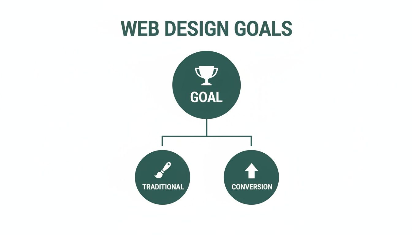
As you can see, both paths start from the same place, but they head in very different directions. One aims to impress, while the other aims to get things done.
Pillar 1: Crystal-Clear Value Proposition
When someone lands on your site, you have just a few seconds to answer their most important question: "What's in it for me?" Your value proposition is that answer. It has to be a short, powerful statement that explains the unique benefit you deliver.
This isn't your company slogan or mission statement. It's a direct promise of value. A great value proposition sits right at the top of the page, "above the fold," and should be the first thing a visitor reads. It instantly clarifies what you do and why they should care.
For example, instead of a generic "We Sell High-Quality Accounting Software," a conversion-focused proposition would be, "Save 10 Hours a Month on Bookkeeping. Guaranteed." The first one describes a product; the second sells a solution.
Pillar 2: Intuitive Visual Hierarchy
Visual hierarchy is the art of arranging things on a page to guide a person's eye naturally from the most important information down to the least. It’s basically a visual roadmap for their attention, making sure they see what you want, in the order you want them to see it.
This isn't magic; it's achieved through the smart use of a few key elements:
- Size and Scale: Bigger things grab more attention. Your main headline should always be larger than your subheadings.
- Color and Contrast: A brightly colored Call-to-Action (CTA) button on a plain background is impossible to miss.
- Whitespace: Giving elements room to breathe with empty space makes them stand out and reduces mental clutter for the user.
A strong visual hierarchy gets rid of confusion and directs a visitor's focus straight down the path to conversion. It makes your site feel effortless to use. To dig deeper into how design choices affect performance, check out our guide on how web design and SEO combine for success.
Pillar 3: Compelling Calls-To-Action
Your Call-to-Action (CTA) is the trigger for the conversion. It's the button or link that asks the user to take that next step. A weak, generic CTA like "Submit" or "Click Here" is a massive missed opportunity.
Effective CTAs use strong, action-oriented words that communicate a clear benefit. Instead of "Download," try "Get My Free Ebook." The language should create a sense of value and urgency, making the person want to click. Placement is just as important—CTAs should show up at logical decision points as someone moves through your site.
A well-crafted CTA isn't just a button. It's the final sentence of your page's argument, the last little nudge that turns a visitor's interest into a measurable action.
Pillar 4: Blazing-Fast Page Speed
In an age of instant gratification, a slow website is an absolute conversion killer. Every second a user has to wait for your page to load, their patience—and your credibility—evaporates. Studies have shown that even a one-second delay can tank conversions.
Optimizing for speed means doing things like compressing images, cleaning up code, and using a solid hosting service. A fast website shows you respect your visitor’s time, keeps them engaged, and signals that you run a professional, efficient operation. All of this adds up to better conversion rates.
Pillar 5: Unshakable Trust Signals
Before a visitor will hand over their email address, let alone their credit card number, they have to trust you. Trust signals are the elements you place on your site to build that confidence and credibility.
Some of the most powerful trust signals include:
- Customer Testimonials and Reviews: Social proof shows that real people have had great experiences with your brand.
- Security Badges: Displaying SSL certificates and secure payment logos reassures users that their information is safe.
- Case Studies and Data: Proving your results with concrete data is one of the strongest ways to demonstrate your value.
- Clear Contact Information: A visible phone number and a physical address show you're a real, legitimate business.
Sprinkling these signals throughout your site, especially near conversion points like checkout forms, can make a huge difference in reducing visitor anxiety and boosting conversions.
Pillar 6: Mobile-First Design
The simple fact is, most web traffic now comes from mobile devices. A mobile-first approach means you design the experience for the smallest screen first and then scale it up for desktops. This forces you to streamline the core user journey for the majority of your audience right from the start.
This approach ensures your site delivers a great experience on any device, which can lead to 11% higher conversion rates. With the number of smartphone users expected to hit 6.3 billion by 2029, a mobile-optimized site isn't just a nice-to-have feature—it's essential for survival.
Pillar 7: Genuine Accessibility
Finally, a truly conversion-focused website is one that everyone can use. Web accessibility ensures that people with disabilities can navigate, understand, and interact with your site without barriers.
This includes practical steps like providing descriptive "alt text" for images, ensuring text has enough color contrast to be readable, and making sure your site can be fully navigated with just a keyboard. Not only is this the right thing to do, but it also opens up your site to a wider audience and, frankly, improves the user experience for every single visitor.
Your Blueprint For Building a Conversion Machine
Knowing the principles of conversion-focused web design is one thing. Actually putting them into practice is a whole different ball game. A website that consistently brings in leads and sales doesn’t just happen by magic—it’s the product of a deliberate, step-by-step process that moves from deep strategic thinking to razor-sharp execution and, finally, to constant fine-tuning.
Think of this as your blueprint for turning all that theory into a powerful, revenue-generating asset. We're not just rushing to make something that looks pretty. We're building a growth engine, piece by piece, making sure every single part has a job to do. Let’s break down this journey into four clear phases, giving you a roadmap to follow so your website is engineered for results from day one.
Phase 1: Discovery And Strategy
Before you even think about colors or fonts, you have to do your homework. This first phase is all about getting a deep understanding of who you're talking to and what you want them to do. It’s where you ask the big, tough questions, and the answers you find will shape every single decision that follows. If you skip this, you’re just guessing.
The mission here is to define what success actually looks like and who you’re building this for. It’s not enough to know basic demographics; you need to get inside their heads. What are their motivations? What drives them crazy? What problem are they hoping you can solve the moment they land on your site?
Your discovery checklist should cover:
- Audience Personas: Go beyond the basics and create rich profiles of your ideal customers. What are their goals, pain points, and how comfortable are they with technology?
- Competitor Analysis: Snoop on your top competitors. See what they're doing well and, more importantly, where their experience falls flat. Those gaps are your opportunities.
- Defining KPIs: Get specific. What metrics will tell you if you're winning? Is it a 2% increase in demo requests? A 15% reduction in abandoned carts? Write them down.
- Value Proposition Mapping: Nail down what makes you different and better. Then, map out how every page on your site will hammer that core message home.
Phase 2: Wireframing And Design
With a solid strategy in your back pocket, it’s time to build the skeleton of your website. This is where wireframing comes in. We’re talking simple, black-and-white layouts that focus purely on structure, hierarchy, and the user’s journey. Think of it as the architectural blueprint for a house—you figure out where the rooms and hallways go long before you pick out the furniture.
This stage is absolutely critical because it forces everyone to think about function without getting distracted by flashy visuals. You can spot potential roadblocks and smooth out the path to conversion early, which saves a ton of time and money later. Only after the wireframes get the green light does the visual design begin, adding your brand’s personality with colors, typography, and imagery.
A wireframe forces you to focus on function over aesthetics. It ensures the user's journey is logical and frictionless before you invest a single dollar into visual design, preventing costly mistakes down the line.
Phase 3: Testing And Launch
Here's a hard truth: your new design isn't finished until real users say it is. Before you pop the champagne and launch the site, you have to test your assumptions to make sure the design actually works in the real world. This is your chance to catch any confusing usability issues and prove that your brilliant design choices are, in fact, brilliant.
Testing bridges the gap between what your team thinks will work and how people actually behave. The feedback you get here is pure gold, allowing you to make those final, crucial tweaks before going live.
Key testing activities include:
- Usability Testing: Sit down with real people (or watch them virtually) as they try to complete tasks on your site. Where do they get stuck? What makes them hesitate? Their struggles are your to-do list.
- A/B Testing Key Pages: If you're redesigning an existing site, pit the new design against the old one. Let the data tell you which version is better at hitting your conversion goals.
- Cross-Browser and Device Testing: Your site has to look and work flawlessly everywhere—on Chrome, Safari, and Firefox, and on every device from a huge desktop monitor to the smallest smartphone.
Phase 4: Analysis And Iteration
Launching your website isn't the finish line. It's the starting line. A truly conversion-focused website is never really "done." It’s a living thing that evolves based on real data and user behavior. This final phase is a continuous loop: measure, learn, and improve.
As soon as the site is live, you start collecting invaluable data on how people are interacting with it. Tools like Google Analytics and heatmaps essentially become your eyes and ears, showing you exactly what’s working and what’s falling flat.
This is how you turn a good website into a great one. You stop relying on opinions and start letting data guide your decisions. This cycle of continuous improvement is the secret to maintaining a high-performing website that acts as your best salesperson, 24/7.
How Site Speed Impacts Your Bottom Line
Long before a visitor ever reads your headline or lays eyes on your brilliant offer, one thing has already made a first impression: speed. In our instant-gratification world, a slow website is the digital equivalent of a long, frustrating line at a checkout counter. Most people will just walk away.
This isn't just about avoiding user frustration; it's about protecting your revenue. A sluggish site actively bleeds customers, making speed an absolute cornerstone of conversion-focused design. Every split-second matters, directly affecting your ability to turn visitors into buyers.
The High Cost Of A Single Second
It's tempting to think a second or two of delay doesn't matter much, but the financial damage is immediate and shockingly severe. When a page lags, patience evaporates, and so does trust. A slow site just feels unprofessional and unreliable, creating a poor first impression that’s incredibly hard to shake.
This isn’t just a hunch; the data is crystal clear. Research from Google shows that a mere one-second delay in page load time can torpedo conversions by a whopping 20%. Think about that. For every second of waiting, you could be losing one-fifth of your potential sales.
Your website’s speed is one of the most powerful trust signals you have. A fast, responsive site tells users that you are professional, efficient, and that you respect their time—qualities that make them more likely to convert.
Decoding Performance: Core Web Vitals Explained
So, how do we measure "speed"? Google uses a specific set of metrics called Core Web Vitals to quantify the real-world user experience on a page. While the names sound a bit technical, the concepts behind them are pretty straightforward.
Here’s what they actually measure:
- Largest Contentful Paint (LCP): This is all about perceived loading speed. It measures how long it takes for the main event—the largest image or block of text on the screen—to actually appear.
- First Input Delay (FID): This measures responsiveness. How long does it take for your site to react when a user first does something, like clicking a button? A long delay is infuriating.
- Cumulative Layout Shift (CLS): This is all about visual stability. Have you ever tried to click a button, only to have an ad load and push it down the page? That’s CLS, and it’s a conversion killer.
Improving these scores isn't about appeasing a search engine; it's about fixing the very things that make users bounce. If your site is on WordPress, we've put together a full guide on how to improve website speed on WordPress.
Practical Steps To A Faster Website
Getting your site to load quickly is a mix of smart design choices and behind-the-scenes technical work. The good news is you don't need to be a coding genius to make a huge difference.
Start by focusing on these three high-impact areas:
- Optimize Your Images: Huge, uncompressed images are the number one cause of slow websites. Use modern formats like WebP, make sure your images are sized correctly for where they’ll appear, and always run them through a compression tool.
- Enable Browser Caching: Caching tells a visitor's browser to save parts of your website, like your logo and stylesheets. The next time they visit, the page loads almost instantly because their browser already has those files handy.
- Choose Quality Hosting: Your web host is the foundation. A cheap, shared hosting plan might save a few dollars, but it will crumble under traffic, bringing your site to a crawl. Investing in a solid host is one of the best moves you can make for both speed and sales.
Using AI To Create Smarter User Experiences

The next frontier for high-converting websites is all about personalization. Imagine a site that morphs in real-time, showing each visitor precisely what they're looking for, the moment they arrive. This isn't some far-off concept; it's what artificial intelligence is making possible right now.
AI allows us to move past the old "one-size-fits-all" model. Instead of blasting every visitor with the same generic message, we can create dynamic experiences that feel like they were made just for them. It’s not about replacing the human touch; it's about scaling it, creating a smarter, more responsive conversion engine for your business.
From Static Pages To Dynamic Conversations
Think about it this way: a traditional website is a static billboard. Everyone who drives by sees the exact same thing. An AI-powered website, on the other hand, is like a great salesperson who can read the room and tailor their pitch on the fly. This shift creates a far more relevant and persuasive journey from the very first click.
For example, AI can switch up the headline on your homepage based on the ad a visitor clicked. If they came from an ad promising "50% Off," they see a message that reinforces the deal. If they clicked one about "Premium Quality," the headline reflects that. This kind of immediate alignment with their intent is huge for keeping people engaged and slashing bounce rates.
AI personalization is about making users feel seen and understood. It transforms a generic user experience into a one-on-one conversation, building trust and guiding visitors more effectively toward conversion.
Practical AI Applications For Higher Conversions
You don’t need a Fortune 500 budget to get started with AI. There are plenty of accessible tools that can have a real impact on your bottom line. Personalization is a game-changer for conversion focused web design, and the numbers back it up. We’ve seen reports that personalized website content can lift conversions by 30% or more, with more advanced systems delivering even bigger gains.
Here are a few practical ways you can put AI to work:
- Smart Chatbots: These aren't your old, clunky chatbots with canned responses. Modern AI chatbots understand intent, handle complex questions 24/7, and can even qualify leads before passing them to your team.
- Personalized Product Recommendations: For e-commerce, AI can analyze browsing habits and past purchases to show product suggestions that actually make sense, moving far beyond generic "best-seller" lists.
- Adaptive Content: AI can dynamically show a visitor the case studies, testimonials, or blog posts most relevant to their industry or role. This makes your content feel incredibly specific and valuable to their situation.
These systems don't just sit there; they learn and get better over time, constantly fine-tuning the experience. You can dive deeper into this in our article on AI-powered web design and the future of user experience. By getting the right message in front of the right person at the right time, AI transforms your website into a much more effective sales and marketing tool.
How to Measure What Actually Matters
A great-looking website is nice, but if it’s not bringing in business, it's just an expensive brochure. To really nail conversion-focused design, you have to get past subjective opinions and start measuring what actually moves the needle. It's about tuning out the vanity metrics and zeroing in on the numbers that prove your website is doing its job.
Think of your website as your most dedicated salesperson—it works 24/7. You wouldn't judge a salesperson just on how they dress; you'd look at their sales numbers. It’s the same with your website. Success is measured by key performance indicators (KPIs) that tie directly to your bottom line.
A data-driven approach turns web design from an art project into a predictable growth engine. It lets you prove your return on investment and make smart, continuous improvements.
Your Core Conversion Dashboard
It’s easy to get lost in an ocean of data. To keep things clear, start with a simple dashboard that tracks just a handful of essential metrics. These three KPIs will give you a quick, high-level snapshot of your website's health and its ability to generate revenue.
Conversion Rate: This is your website’s report card. It’s the percentage of visitors who complete a key action, like making a purchase or filling out a contact form. If this number is going up, your design is working.
Cost Per Acquisition (CPA): This metric connects your website’s performance directly to your marketing budget. It tells you exactly how much you're spending to get one new customer. A well-designed site lowers your CPA by converting more of the traffic you’re already paying for.
Average Order Value (AOV): For any e-commerce business, this is a huge one. It shows how much the average customer spends in a single transaction. Smart design choices, like well-placed upsells or product bundles, can bump this number up significantly, increasing revenue without needing a single extra visitor.
Digging Deeper into User Behavior
Once you have a handle on those core numbers, you can start looking at secondary metrics that explain the "why" behind your conversion rate. These clues help you pinpoint specific pages or user journeys that are either performing brilliantly or falling flat.
Analyzing your Top Converting Pages is a great place to start—it shows you what’s resonating with your audience so you can apply those lessons elsewhere. On the flip side, looking at your Top Exit Pages shows you exactly where people are getting stuck or losing interest and leaving.
When you put these two insights together, you can make targeted fixes that guide more users all the way to the finish line.
A Few Common Questions
It's natural to have questions when you're thinking about redesigning your website. Let's tackle some of the most common ones I hear about conversion-focused design.
Is This Going to Cost a Lot More?
It's easy to see conversion-focused design as just another expense, but it’s really an investment in an asset that’s built to make you money. While the upfront cost might be more than a simple template site, that's because you're paying for the deep strategy, user research, and testing that turns visitors into customers.
Think of it this way: a basic site is like a digital brochure, while a conversion-focused site is your hardest-working salesperson. The goal is to generate a return that makes the initial investment look small in comparison.
How Long Before I Actually See Results?
Some changes give you an instant win. Fix your site speed, and you’ll likely see your bounce rate drop right away. That's the easy part.
But the real, meaningful lift in your conversion rates—the kind that impacts your bottom line—takes a little more time. You need to launch, gather real user data, and run a few A/B tests to see what truly works. You can typically expect to see measurable, reliable growth within one to three months as those insights start rolling in.
Can I Do This With My Current Website?
Absolutely. You don't have to tear everything down and start from scratch. In fact, making gradual, strategic improvements is often the smartest way to go.
You can start by picking just one of the seven principles we've discussed. Focus on the low-hanging fruit first. Maybe that's clarifying your value proposition on the homepage, rewriting your calls-to-action, or optimizing your most popular landing pages. Even small, targeted tweaks can deliver a surprisingly big impact.
Ready to turn your website from a passive brochure into an active, revenue-driving machine? At Danny Avila, we build websites that blend smart strategy with flawless execution to deliver real, measurable growth. Book your free consultation today!