If you want to reduce cart abandonment, the two biggest levers you can pull are eliminating surprise costs and making the checkout process ridiculously simple. Tackling these two friction points head-on solves the most common reasons shoppers leave, turning would-be lost sales into revenue.
Why Shoppers Really Bail on Their Carts
That abandoned cart notification can feel like a personal rejection, but it's almost never about your products. Most of the time, it's a direct reaction to a frustrating or confusing buying experience. The journey from "Add to Cart" to "Complete Purchase" is a minefield of potential roadblocks that can stop even the most motivated buyer in their tracks.
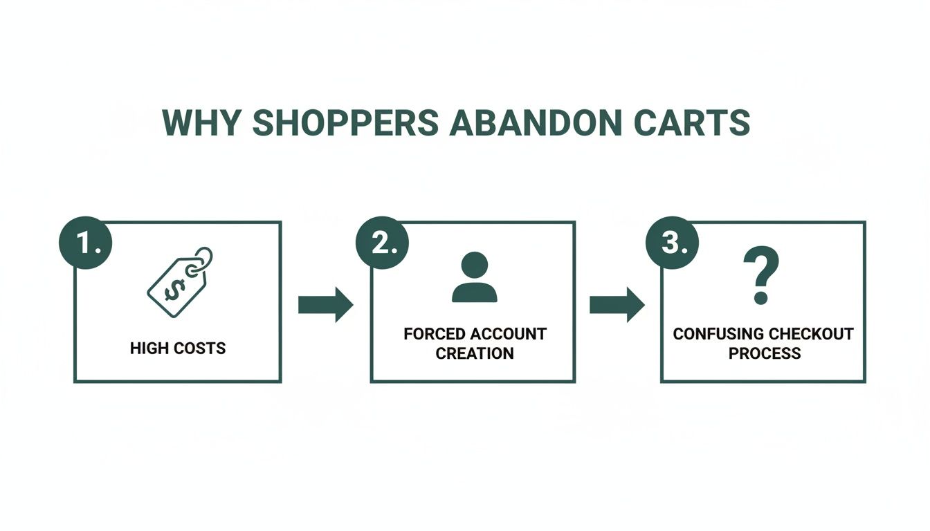
Figuring out what those roadblocks are is the first step to clearing the path. Today's customers expect speed, transparency, and a smooth ride. A clunky interface, a surprise shipping fee, or forcing someone to create an account are all common culprits that send them packing.
The Financial and Technical Roadblocks
The biggest reasons for cart abandonment really boil down to two things: financial surprises and technical headaches. The average cart abandonment rate across all industries has climbed to a staggering 70.19%, representing a massive amount of lost revenue for online stores. The number one offender? Unexpected shipping costs, which drive away 25% of shoppers. Add in other extra fees like taxes, and you lose another 55% of potential buyers.
The good news is that simple transparency makes a world of difference. You can dive deeper into more cart abandonment statistics to see just how prevalent these issues are.
This visual perfectly illustrates the top reasons shoppers get cold feet at the last minute.
The data makes it crystal clear: what happens after a customer adds a product to their cart is just as critical as what got them there in the first place.
Common Cart Abandonment Triggers and Their Solutions
Here’s a quick look at the most frequent reasons shoppers leave their carts and the practical fixes you can implement today.
| Abandonment Trigger | Impact on Shopper | Actionable Solution |
|---|---|---|
| Unexpected Shipping Costs | Creates sticker shock and breaks trust. | Display shipping costs upfront on product pages or offer a shipping calculator in the cart. |
| Forced Account Creation | Feels like a high-commitment barrier to a simple purchase. | Offer a prominent guest checkout option. |
| Long/Confusing Checkout | Causes frustration and makes the process feel like a chore. | Streamline the checkout into fewer steps and remove non-essential form fields. |
| Site Performance Issues | A slow site feels unprofessional and untrustworthy. | Optimize image sizes, use a content delivery network (CDN), and ensure fast server response times. |
| Lack of Trust Signals | Raises doubts about the security of their payment info. | Prominently display security badges (SSL, McAfee, Norton), customer reviews, and return policies. |
By addressing these common pain points, you're not just plugging leaks; you're building a more trustworthy and user-friendly experience that encourages shoppers to complete their purchases.
Other Key Reasons for Cart Abandonment
Beyond sticker shock, a few other significant factors contribute to this problem. Each one is a golden opportunity for you to improve the checkout experience.
- Forced Account Creation: Nobody wants the hassle of creating—and remembering—another password for a one-time purchase. Offering a guest checkout option is a non-negotiable feature for modern ecommerce.
- Complicated Checkout Process: If your checkout feels like filling out a tax form, people will give up. Too many steps, unnecessary fields, or a confusing layout can quickly overwhelm a customer. Aim for a clean, linear process.
- Performance and Security Concerns: A slow-loading site or a checkout page that looks sketchy is an instant dealbreaker. People need to see visible security badges and feel confident that their payment information is safe.
Tackling these core issues isn't just about fixing problems—it's about seizing your biggest opportunities for revenue recovery. Every friction point you remove makes the path to purchase smoother and more profitable.
Crafting a Frictionless Checkout Experience
Once a customer hits that "buy" button, your job is to make the rest of the journey feel like an express lane, not a 10-mile detour. A clunky, confusing, or long checkout process is a guaranteed way to lose a sale. But with a few smart adjustments, you can turn it into one of your biggest conversion assets.
The single best change you can make? Offer a big, bold guest checkout option. Forcing someone to create an account just to buy from you is like putting a bouncer at the door. In fact, studies show 24% of shoppers will walk away if they're forced to register. Let them buy first, then ask if they’d like to save their info for next time. It’s a simple switch in timing that makes all the difference.
Simplify the Path to Purchase
Think of your checkout form as a quick, polite conversation. You only ask for what you absolutely need to get the job done. Every single field you add is another opportunity for a customer to get frustrated and leave.
- Slash your form fields. Seriously, do you really need their middle name? Their company title? Probably not. Cut it down to the bare essentials: name, email, shipping address, and payment details. That's it.
- Lean on autofill and validation. Tools like the Google Places API can autofill a customer's address as they type, which is a huge time-saver and prevents typos. Real-time validation that shows a green checkmark next to a correctly filled field is another small touch that reduces friction.
- Show them the finish line with a progress bar. A simple visual that shows where they are—like "Shipping," "Payment," and "Review"—manages expectations. It answers the question "How much longer will this take?" before they even have to ask.
A frictionless checkout isn't about fancy design; it's about respecting the customer's time. The easier you make it for them to hand over their money, the more likely they are to actually do it.
Speed Up the Final Step with Modern Payments
In a world of one-click ordering, nobody wants to manually type in their 16-digit credit card number on a tiny phone screen. This is where modern payment and login options become non-negotiable.
Integrating social logins—think "Continue with Google" or "Continue with Apple"—lets shoppers create an account and pre-fill their info with a single click. It’s the perfect middle ground between a guest checkout and the hassle of a full-blown registration form.
Even more critical are express payment wallets like Apple Pay, Google Pay, and PayPal. These let customers complete a purchase using their saved information, often with just a fingerprint or face scan. It turns a multi-step chore into a single, satisfying tap. Remember, a slow site can kill conversions just as fast as a confusing form. If you're running on WordPress, we've got a detailed guide on how to improve website speed on WordPress that's packed with tips.
Get Real About Pricing and Shipping Transparency

If you only have the bandwidth to fix one thing, make it this. Surprise costs are the undisputed heavyweight champion of conversion killers. We’ve all been there: you add a $50 item to your cart, mentally committing to that price, only to be hit with a surprise $12 shipping fee and taxes on the final screen. It feels like a bait-and-switch.
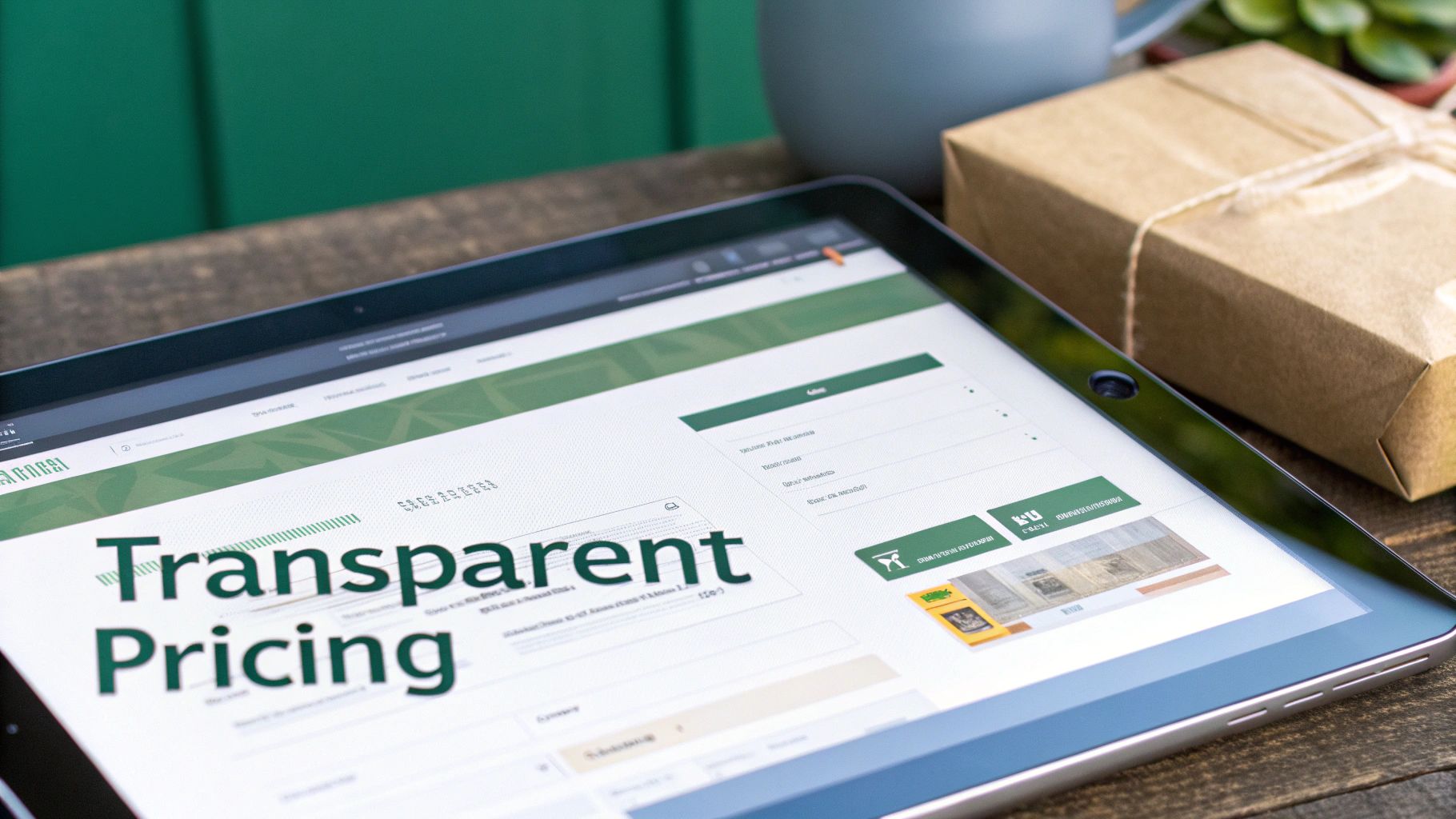
That sticker shock is the single biggest reason why an estimated 55% of shoppers ditch their carts. This isn't just about the extra money; it's a breach of trust. The antidote is radical transparency, right from the start. Your mission is to completely eliminate the idea of a "surprise fee."
Instead of hiding costs until the final click, show them loud and clear. Put a shipping calculator or tax estimator right on the cart page—or even better, on the product page itself. All it takes is a simple zip code field. This one change reframes shipping from a last-minute penalty into a known, predictable part of the purchase.
Choosing the Right Shipping Model for Your Business
Picking a shipping model that's both clear and compelling is crucial. The right choice depends on your products, margins, and what your customers expect. It’s not always about being the cheapest; it's about being the clearest.
Here are three popular models that just plain work:
- Free Shipping Thresholds: This is pure psychology, and it's brilliant. "Free shipping on orders over $75" doesn't just waive a fee; it actively encourages shoppers to add more to their cart to hit that magic number. You can boost your average order value (AOV) and cut abandonment at the same time.
- Flat-Rate Shipping: Simplicity sells. Offering a single, predictable cost like "$7.95 flat rate on all orders" removes all the guesswork. Customers know exactly what they're paying from the get-go, which builds confidence and smooths the path to purchase.
- Live Carrier Rates: If you sell items with wildly different weights and ship all over the country, real-time rates from carriers like USPS or FedEx offer total transparency. The customer pays the actual cost, which feels fair and straightforward, especially for heavy or bulky products.
No matter which model you choose, the principle is the same: communicate early and often. A customer who understands the total cost upfront is infinitely more likely to finish checking out than one who feels ambushed at the finish line.
Don't Just Ship—Market It
Your shipping strategy shouldn't just be about logistics; it's a powerful marketing tool waiting to be used. Frame your shipping offer as a genuine benefit, not just another line item.
Splash your free shipping threshold or a special flat-rate deal across the top of your site with a banner. This turns a common point of friction into a compelling reason for someone to buy from you right now.
Think about it from the customer's perspective. They're on the fence about an order. A little progress bar in the cart saying, "You're only $15 away from free shipping!" can be the perfect nudge they need to add one more item and click "Buy." That’s how you turn a potential lost sale into a bigger, completed one.
Winning the Sale on Mobile Devices
If your checkout flow wasn’t built for thumbs, you’re losing money. It’s really that simple. Mobile commerce isn’t just a trend; it's the primary way most people shop now, and a clunky mobile experience is a guaranteed way to drive customers away. A desktop-first mindset just doesn't cut it anymore.
The numbers are pretty telling. Mobile shoppers abandon carts at a staggering 84% rate globally, a huge jump from the 72% seen on desktops. Speed is everything—sites that take more than three seconds to load watch 44% of their potential customers bounce. On the flip side, implementing a one-click checkout can slash abandonment by 22%, proving that convenience is king on the small screen. These are just a few key cart abandonment rate statistics that paint the full picture.
This isn’t about just squishing your desktop site onto a phone. It's about completely reimagining the customer's journey from a mobile perspective.
Design for Thumbs, Not Cursors
Optimizing for mobile goes way beyond a simple responsive layout. You have to think about how people actually use their phones—often with one hand, distracted, and on the go. Every tap and swipe needs to be effortless.
- Make Buttons Thumb-Friendly: Ensure your CTAs are big, bold, and easy to tap without accidentally hitting the wrong thing. I always recommend placing them in the "thumb zone" near the bottom or center of the screen.
- Simplify Form Fields: Little things make a huge difference here. Auto-capitalize names, automatically bring up the numeric keypad for phone numbers, and use steppers or dropdowns so users don't have to type. You're trying to reduce friction at every possible point.
- Embrace Digital Wallets: Integrating options like Apple Pay and Google Pay is non-negotiable in today's market. They transform a frustrating, multi-step chore into a single, secure tap—the gold standard for mobile conversions.
Your mobile checkout should feel less like filling out a government form and more like a quick, guided conversation. Each screen should have one clear job, moving the user smoothly to the finish line without any confusion.
Prioritize Blazing-Fast Load Speeds
On a phone, patience is in very short supply. A slow page doesn't just frustrate a user; it actively destroys trust and makes your brand look amateurish. Technical performance is every bit as important as your visual design.
First up, aggressively compress your images. Great product photos are a must, but they can't be allowed to kill your load times. Use modern formats like WebP and tools that shrink file sizes without turning your images into a pixelated mess.
Next, take a hard look at your navigation. A menu with a dozen dropdowns might work on a desktop, but it’s a usability nightmare on a phone. Strip it down to the absolute essentials so shoppers can find what they need and get to their cart with minimal taps. For a deeper dive, check out these responsive web design best practices to make sure your site is truly built for any device.
Building Trust to Reassure Hesitant Buyers
Every time someone buys from you, they're taking a leap of faith. They're trusting you with their credit card details and expecting you to deliver on your promise. If your checkout page feels even slightly off or unprofessional, that trust evaporates. So does your sale.
Building a fortress of trust isn't a "nice-to-have"; it's fundamental to getting people to convert. This starts with the obvious visual cues. Plastering security badges from names like SSL, McAfee, or Norton across your checkout gives people an immediate sense of safety. It's a quick, visual confirmation that their data is encrypted and protected.
Showcase Proof and Offer Reassurance
Technical security is just one piece of the puzzle. Shoppers are also looking for social proof and clear policies to quiet that little voice of doubt in their heads. They need to see that other real people have bought from you and had a good experience.
Here’s how to do it:
- Sprinkle in Authentic Reviews: Don't just keep testimonials on your product pages. Integrate star ratings and customer quotes right into the checkout flow. A five-star review appearing at that final moment can be the final push someone needs.
- Make Your Return Policy Unmissable: A generous and easy-to-find return policy is a massive risk-reversal tool. Something as simple as a link saying "30-Day Hassle-Free Returns" right next to the final purchase button works wonders.
- Show You're There to Help: A live chat widget or a visible customer service phone number proves you're not hiding. Just knowing that help is a single click away can stop a frustrated shopper from bouncing for good.
Trust is the currency of ecommerce. When a customer feels secure and supported, they're not just buying a product—they're buying into your brand's reliability.
Provide Familiar and Flexible Payment Options
The payment step is the moment of truth. If a customer gets there and doesn't see a payment method they know and trust, you might as well have a broken "buy" button. Offering a range of recognizable options isn't just about convenience; it's about legitimacy.
Think of payment logos as borrowed trust. When someone sees PayPal, Apple Pay, or Klarna, they feel safer because they already trust those brands. These options also streamline the entire process, letting people check out in a click instead of fumbling for their wallet. A well-executed checkout design is the foundation for this, and you can find some great web design inspiration for e-commerce sites to see how the pros handle it.
By layering these signals—security badges, real customer reviews, clear policies, and trusted payment logos—you create an environment where clicking "buy" feels like the most natural and safe thing in the world.
Bring Them Back: Nailing Your Sales Recovery Strategy
An abandoned cart isn't a lost sale; it's a hot lead. Think about it—someone took the time to browse your store, pick out items they wanted, and start the checkout process. They’re this close. Your job is to give them a gentle, helpful nudge to finish what they started.
The most reliable way to do this is with an automated abandoned cart email sequence. But these can't be generic, "you left stuff" emails. They need to be timely, valuable, and part of a bigger, multi-channel game plan.
Crafting the Perfect Email Nudge
Timing is everything here. The first email needs to hit their inbox within one hour of them leaving your site. Any later, and life has already moved on. The purchase is still fresh in their mind, so a simple subject line like "Did you forget something?" is all you need. Inside, show them exactly what they left behind with big, clear product images and a direct link to their pre-filled cart.
Still no action? The second email, sent about 24 hours later, is your next move. This isn't the time to throw a discount at them. Instead, remind them why they should buy from you. Is it your fantastic return policy? Free shipping? Reinforce the value you offer.
If they still haven't come back after three to five days, it's time for the final push. This is where you can create a little urgency with a small, time-sensitive offer. A simple 10% off for the next 24 hours can be incredibly effective at sealing the deal.
Thinking Beyond the Inbox
Email is great, but it's a crowded space. To really maximize your recovery rate, you need to show up in other places, too. A smart strategy meets customers wherever they are.
- SMS Nudges: Text messages are hard to ignore. With an open rate hovering around 98%, a quick SMS can work wonders. A friendly "Hey, your cart is waiting! The items you picked are still here" is often enough to get their attention.
- Retargeting Ads: Use the power of platforms like Meta and Google Ads to follow them around the web. When that exact pair of shoes they almost bought suddenly appears in their Instagram feed, it's a powerful reminder that keeps your brand top of mind.
By weaving these channels together, you build a follow-up system that feels helpful, not pushy. It's a proven way to turn those almost-sales into real revenue and bring your cart abandonment rate down for good.
Common Questions About Reducing Cart Abandonment

As you start digging into cart abandonment, a few questions always pop up. Let's get them answered so you can focus your efforts where they'll make the biggest difference.
What Is a Good Cart Abandonment Rate to Aim For?
It’s easy to get hung up on the industry average, which sits around a whopping 70%. But a "good" rate really depends on what you sell and who you're selling to. High-consideration items will naturally have a higher abandonment rate than everyday essentials.
Instead of fixating on a universal number, focus on your own progress. A great starting point is to aim for a rate below 60%. If you can get it down into the 40-50% range, you're in the company of top-performing e-commerce sites. The real goal is steady, measurable improvement from your current baseline.
How Soon Should I Send the First Abandoned Cart Email?
Timing is everything. You have a very small window to act before a potential customer gets distracted and forgets what they were about to buy. That first email needs to land in their inbox within one hour.
Here’s a simple, effective cadence that works wonders:
- First Hour: Send a friendly, low-pressure reminder. "Did you forget something?"
- 24 Hours: Follow up with a second email that reinforces your brand's value or the product's benefits.
- 3-5 Days: If they still haven't converted, a final email with a small, time-sensitive incentive (like 10% off) can be the push they need.
This tiered approach respects the customer's space while giving you multiple shots at winning back the sale. It’s persistent without being pushy.
Which Single Change Has the Biggest Impact?
If you can only do one thing, do this: get rid of surprise costs. Unexpected shipping fees and taxes showing up at the very last second are the number one reason people leave.
Be upfront and transparent about all costs, showing them on the product page or in the cart—anywhere but the final payment screen. The most powerful way to do this is by offering a clear free shipping threshold. Something like "Free shipping on orders over $75" not only removes the biggest point of friction but also nudges customers to spend a little more. It's a true win-win.
Ready to turn these insights into a unified growth engine? At Danny Avila, we build conversion-focused websites and implement the SEO, ad, and video strategies that drive measurable results. Let's connect and build your marketing solution.