the website mistakes that quietly lose you customers
Most small business website mistakes don’t look like mistakes. The site loads. The pages exist. There’s a logo and a phone number somewhere. From the outside, it seems fine.
But fine isn’t doing any work for you. And the customers who left without calling? They didn’t send a note explaining why.
I see the same patterns every time I look at a local service business site. Contractors, plumbers, landscapers, roofers. Good businesses with real work to show. Sites that quietly talk people out of reaching out before they ever hit the contact page.
Here’s what’s actually happening, and what to do about it.
the most common small business website mistakes
no clear reason to choose you
Most sites answer “what do we do” but never answer “why you.” A homepage that says “Quality Service. Locally Owned. Family Values.” tells a visitor nothing they couldn’t read on a hundred other sites.
The fix is simple but requires honesty. What do you actually do better than the next company? Faster turnaround? Specific neighborhoods you know cold? A specialty most local shops skip? Say the specific thing. Vague trust language doesn’t build trust.
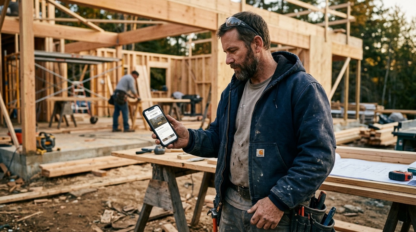
contact info buried or missing on mobile
If someone has to work to find your phone number, most won’t. They’ll go back and call the next result.
Your number should be in the header. Tappable on mobile. Not just in a footer or buried on a contact page two clicks deep. If someone is ready to call you, make it a single tap.
it doesn’t work on a phone
More than half of local searches happen on a phone. Someone’s standing in their driveway, water’s coming through the ceiling, and they’re looking for a plumber. If your site takes ten seconds to load or the text runs off the screen, you lost that job.
Run your site through Google’s free mobile-friendly test. If it fails, this is the first thing to fix. Not the new logo. Not the copy. The phone experience.
every photo is stock
There’s a version of your website that has a smiling family in front of a house that is not your family or your work. A uniformed technician who does not work for you. A handshake photo from 2014.
Customers can tell. It doesn’t feel like a scam. It just feels like you couldn’t be bothered to show them what you actually do. One real photo of your truck, your crew, or a finished job is worth more than twenty polished stock images.
If you have before-and-after shots, use them. That’s proof. Proof converts.
too many words, wrong kind
Dense paragraphs about your company history and core values are not what someone in a buying moment wants to read. They want to know: can you do the job, how do I reach you, and why should I trust you.
Short paragraphs. One idea at a time. Use headers so someone can scan without reading everything. Write like you’re texting a customer, not writing a press release.
slow load speed
Google measures load time. Customers feel it. A site that takes more than three seconds to fully load loses a significant chunk of visitors before the page even appears.
The usual culprits: images that haven’t been compressed, an old hosting plan, a WordPress site with forty plugins fighting each other. A developer can usually identify the problem in under an hour. This one’s worth fixing because it affects both search rankings and whether people stay.
no reason to trust you
Someone landed on your site. They’ve never heard of you. They have no idea if you’re reliable or if you’ll even show up.
What helps: real reviews with names, not just star ratings. Photos of the actual work. How long you’ve been operating. A clear service area so they know you work in their neighborhood. These aren’t flashy additions. They’re the basics of what a cautious buyer needs to see before they pick up the phone.
A page that’s thin on this stuff reads as a company that’s new, unreliable, or has something to hide. Usually none of those are true. The site just doesn’t say otherwise.
where to start
If you’re looking at this list and your site has most of these problems, don’t try to fix everything at once. Pick the one that costs you the most.
Usually that’s mobile speed or buried contact info. Those are the fastest to fix and the ones that directly interrupt someone who was ready to hire you.
If your site needs a real overhaul, I can help with that. Take a look at what that looks like and reach out if it makes sense to talk.
common questions
how do I know if my website is actually losing me customers?
Look at your analytics if you have them. High bounce rate on mobile, low time on page, visitors who leave before reaching the contact page. If you don’t have analytics set up, that’s also a problem worth solving. You can’t fix what you can’t measure.
do I need to rebuild my whole site to fix these?
Usually not. Some of these are quick edits: move the phone number, compress the images, swap out the stock photos. A full rebuild makes sense when the structure itself is working against you, like an old site that can’t be made mobile-friendly without starting over.
how much does it actually matter what my website looks like?
It matters less than what it does. A clean, plain site that loads fast and makes it easy to call you will outperform a beautiful site that’s slow and confusing. Design is the last thing to optimize. Function is the first.